In the Margin, a content hub for product design
// Overview
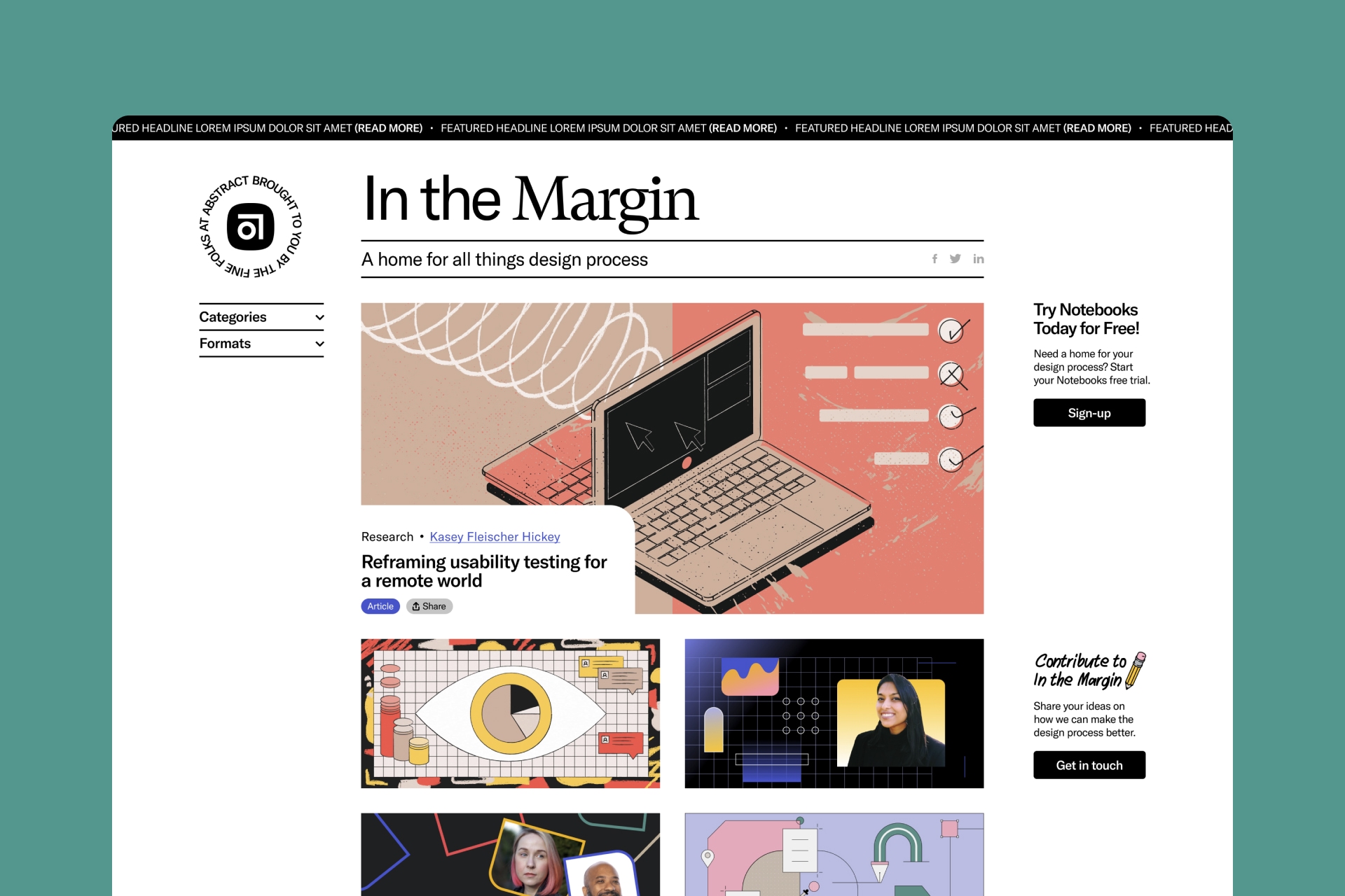
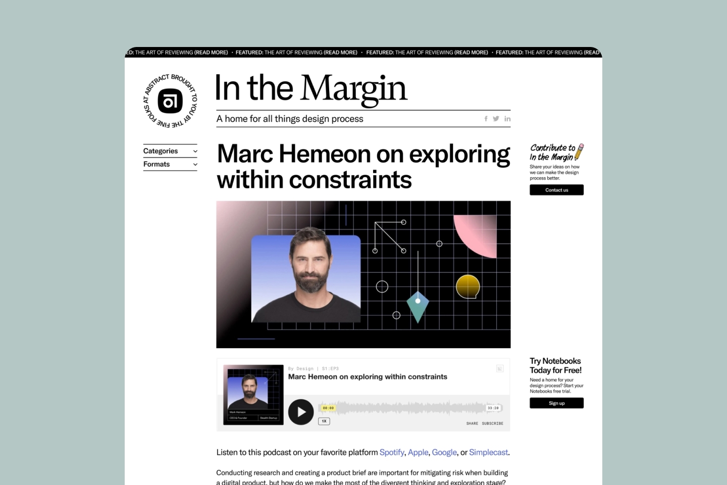
To help separate product related information and editorial content, the team at Abstract decided to create a separate hub to hold their content that was focused on the process.
// Responsibilities
From start to finish, Mike helped conceptualize, design, and build In the Margin. He was specifically responsible for design and development, though he did have a role in early exploration and strategy.
// Goals
Abstract’s goal for In the Margin is to become a main hub for knowledge and learning about the product design process. Stemming from that, Abstract hopes to gain more brand and product awareness.
Design
Process
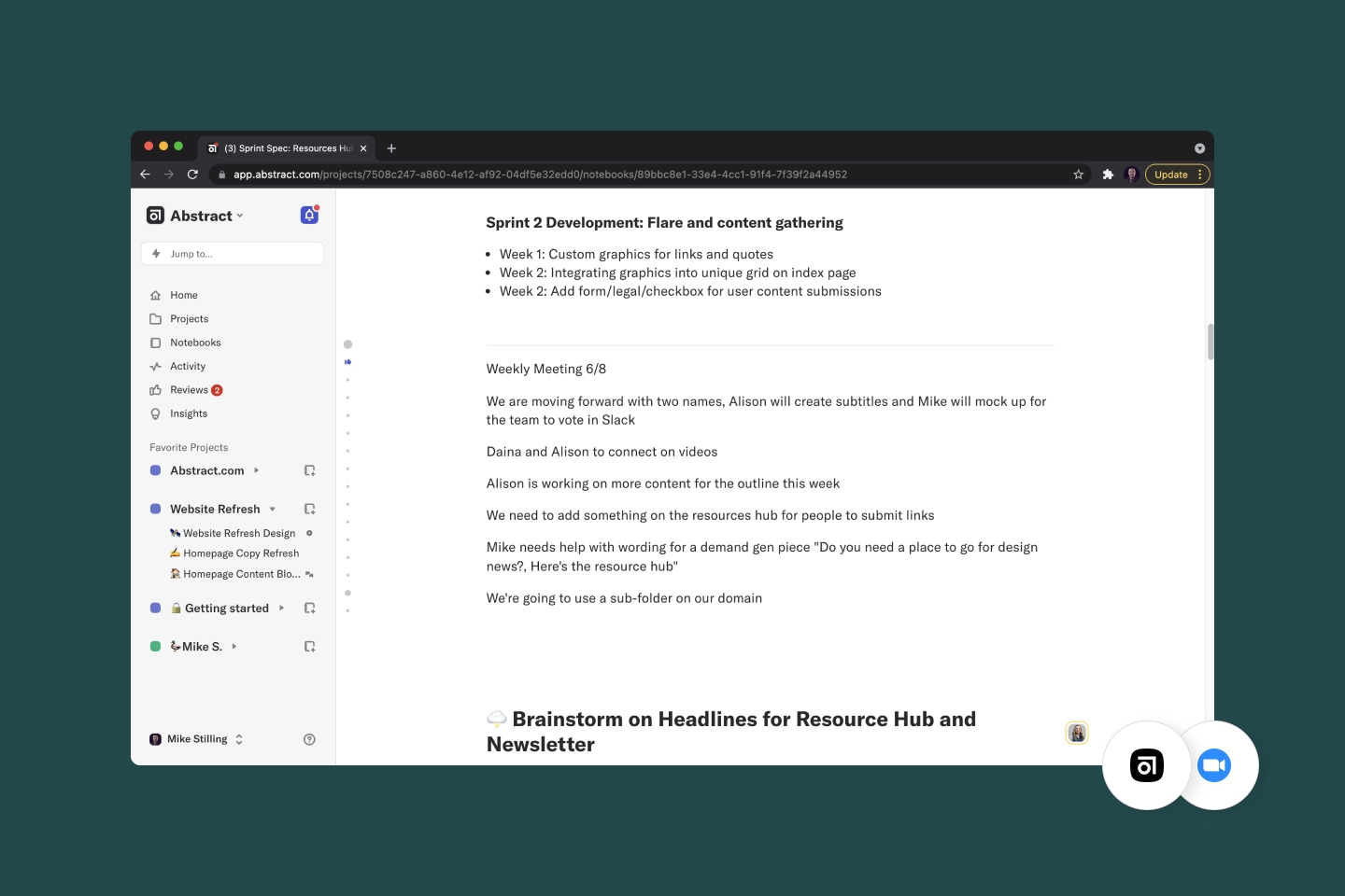
// Discovery
Abstract’s blog was starting to become a mess of product updates and company news mixed with editorial content. It was difficult for users to identify what was what. It also felt somewhat inauthentic to have the two mixed.
// Strategy
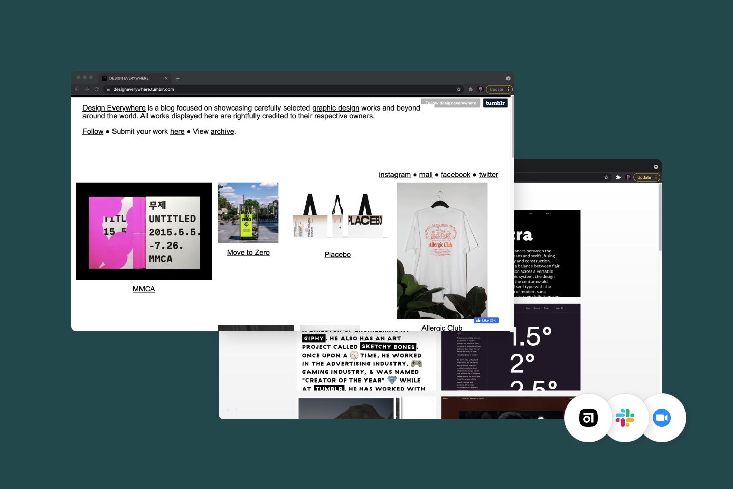
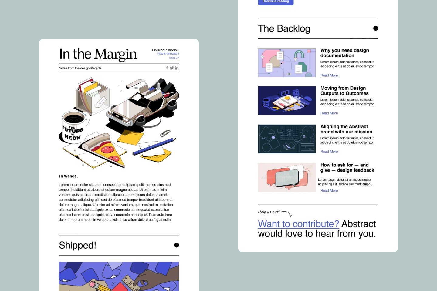
The team explored a few visual and structural routes. Early on, a more typical corporate resources page structure seemed fitting, but lacked character. The team decided to take the nostalgic route and take design ques from designer-loved platforms like Tumblr. Abstract also launched a newsletter that drives users to the site (where emails can also be captured).
// Visualization
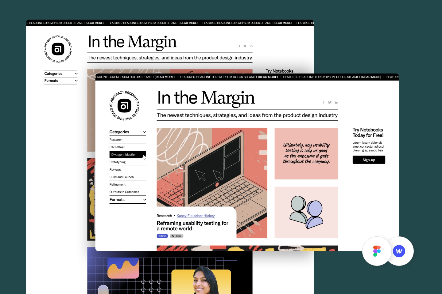
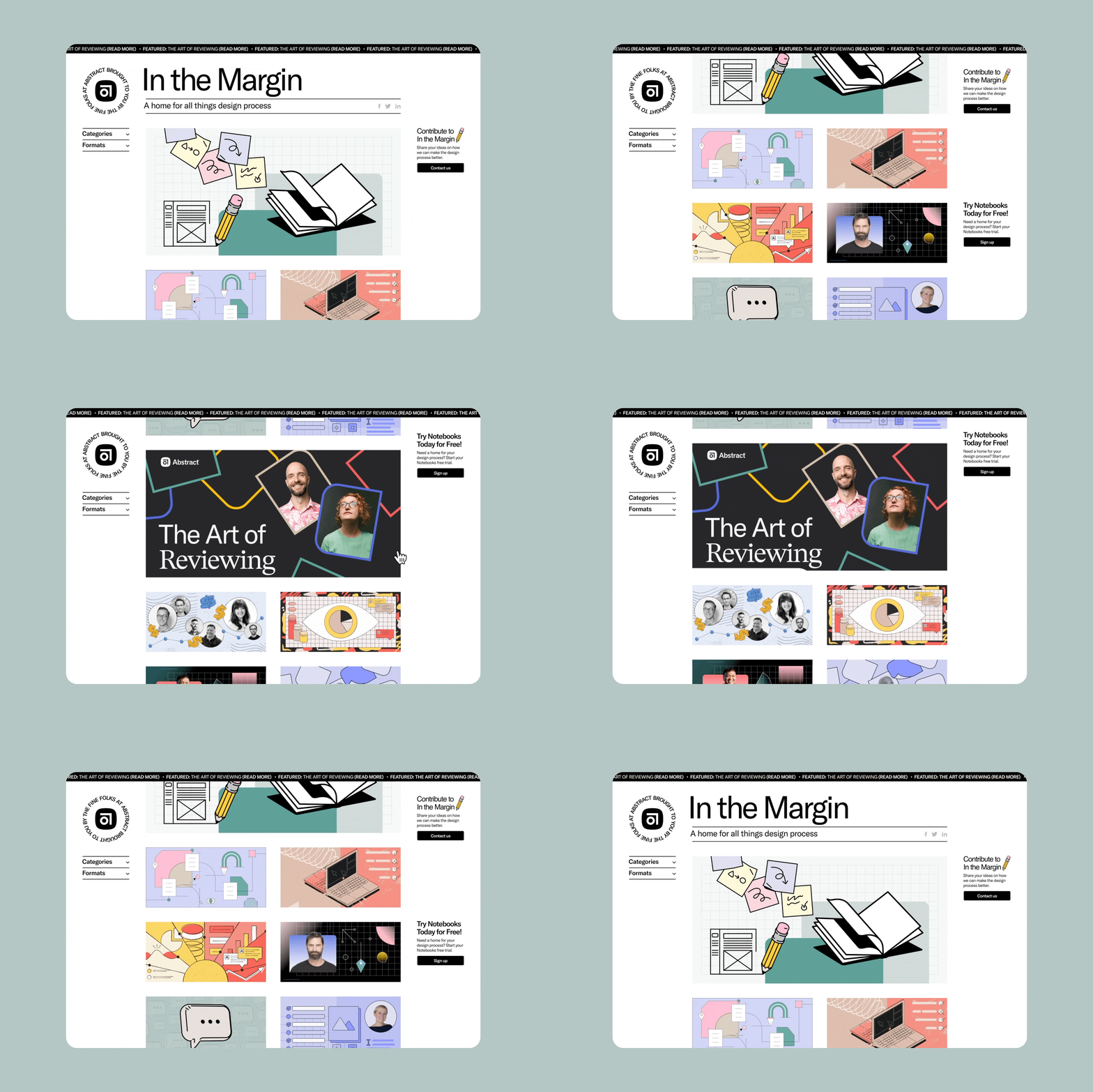
Strategy and visualization for this project ran somewhat parallel. Since the hub was for designers, aesthetics played are big role in both. It was also important to consider the limitations of Webflow so that we didn’t over promise on form and functionality.
// Implementation
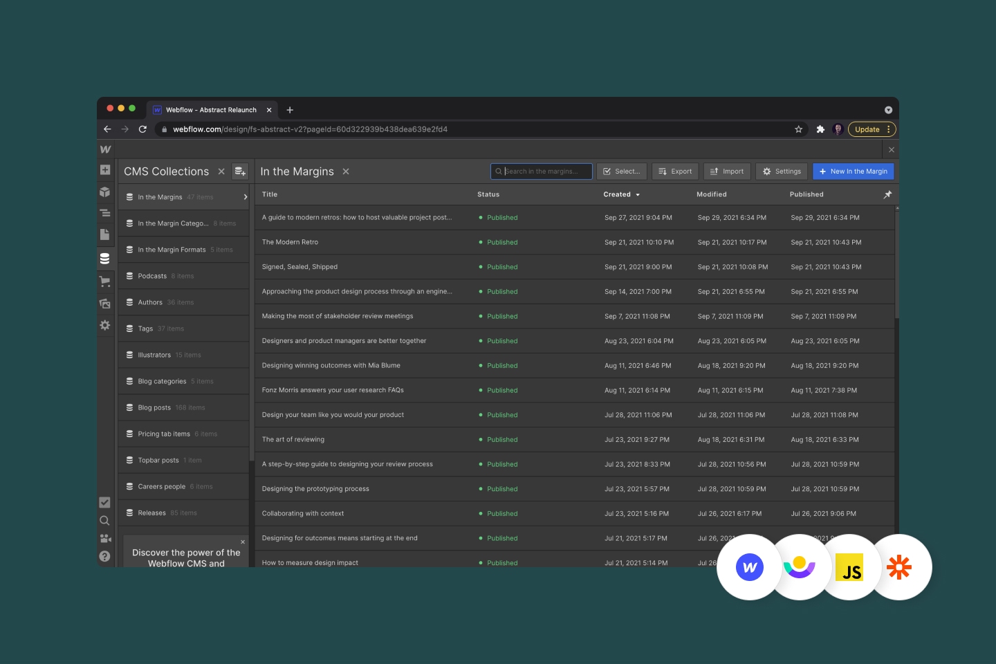
Mike developed this project in Webflow. It was important to consider the best way to manage multiple content collections to ensure it was sustainable going forward. Mike also designed and developed the newsletter email.
Outputs + Outcomes +
Outputs + Outcomes +

// Outcomes
In the Margin launched in August of 2021. So far, it has had great traction. It has been shared by some big influencers in this space and continues to get new sign-ups daily.
// Team
Lead
Alison Harshbarger
Strategy
Mike Perez
Direction
Daina Lightfoot
Brand
Jason Combs