// Overview
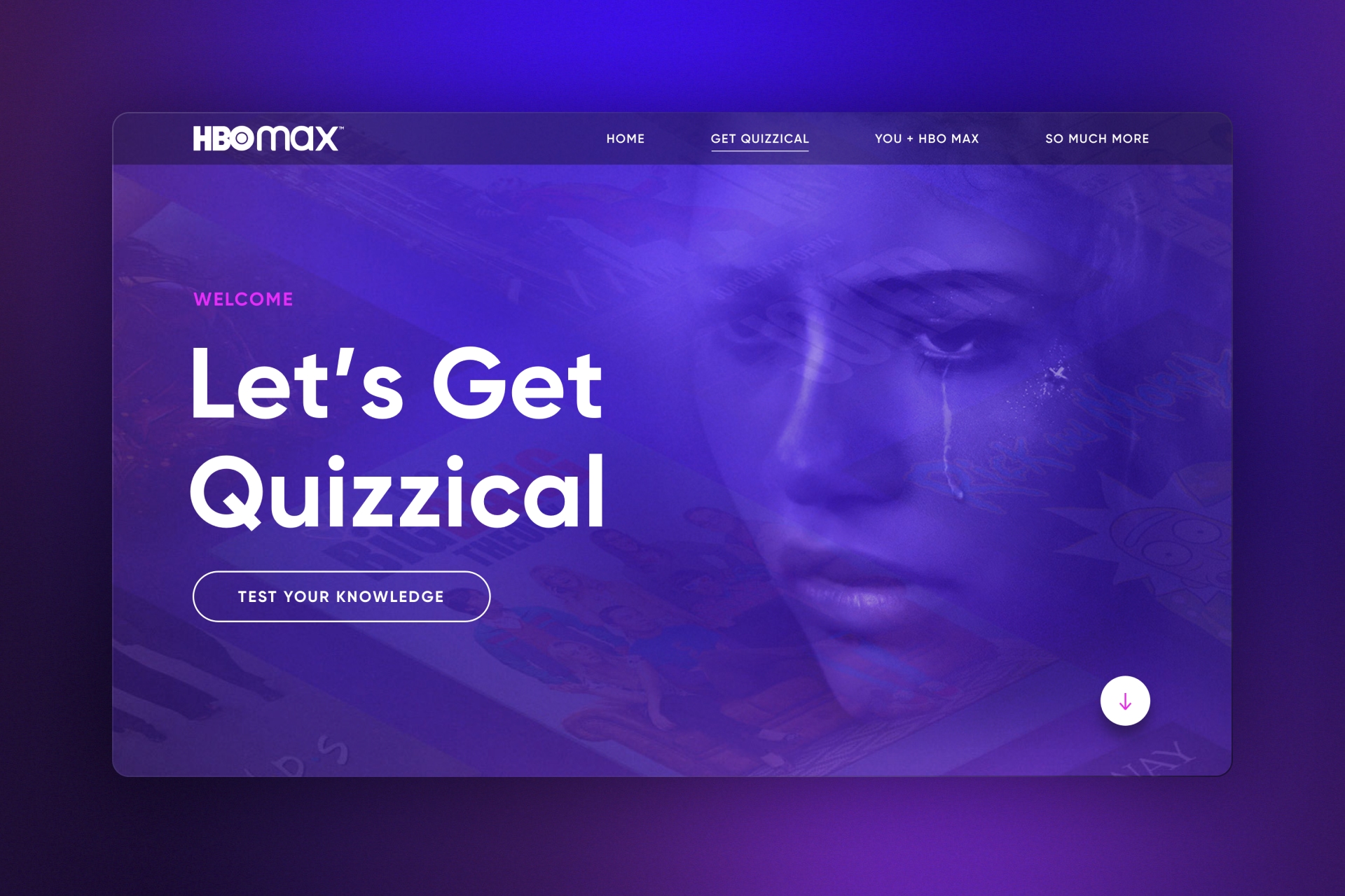
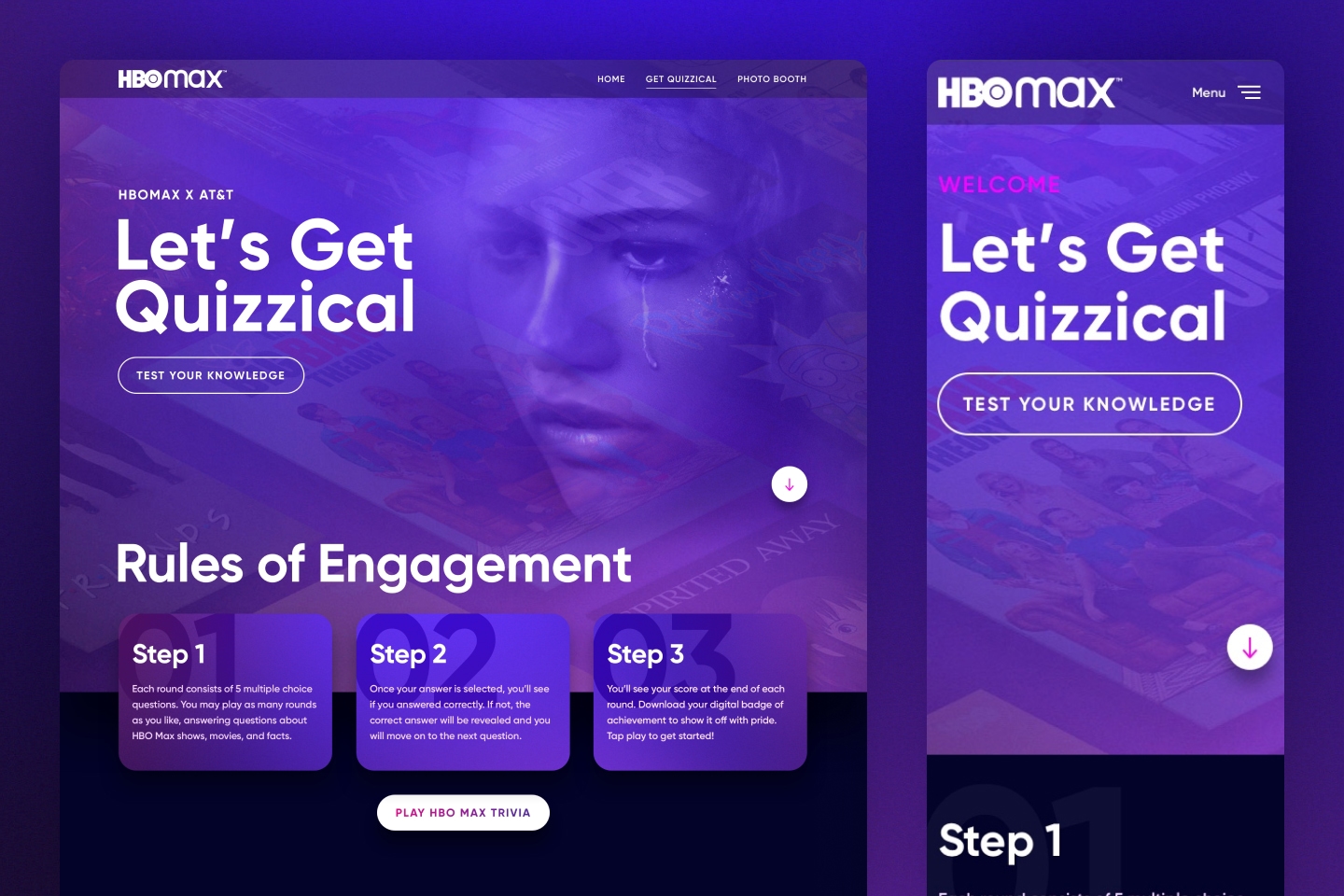
To educate and hype teams across AT&T and HBO on the new HBO Max platform, GMR was asked to create an interactive site centered around the platforms content.
// Responsibilities
Mike was responsible for the UX and UI design on this project. Since this type of project was a common request, Mike also focused on how it could be templatized and re-skinned for future projects.
// Goals
As mentioned above, the main goal was to educate and generate excitement for teams across AT&T and HBO Max. With more buzz and knowledge, sales associates would be better equiped to sell.
Design
Process
// Discovery
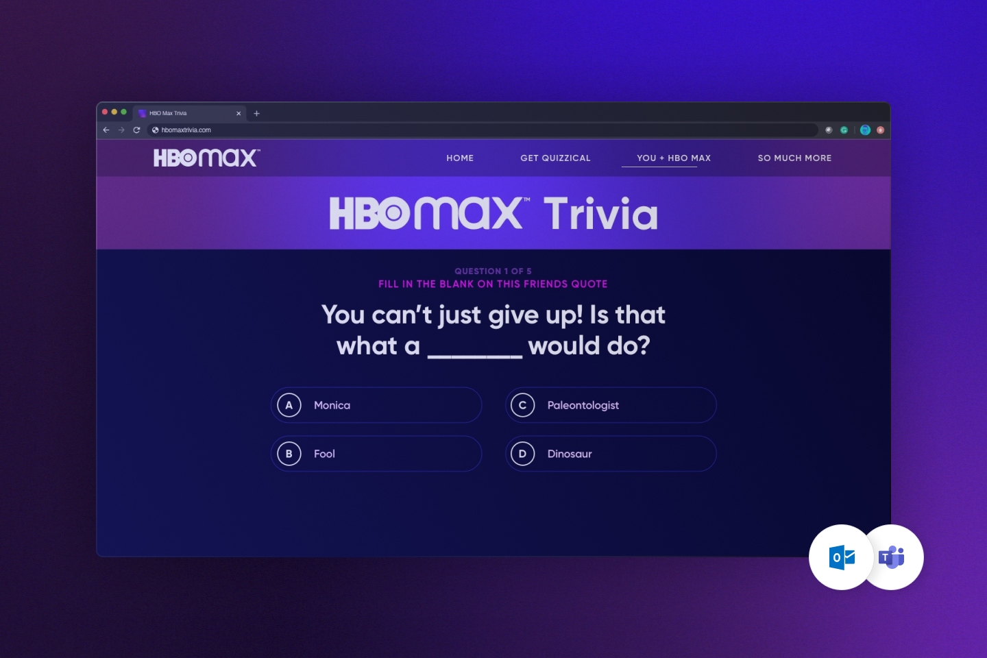
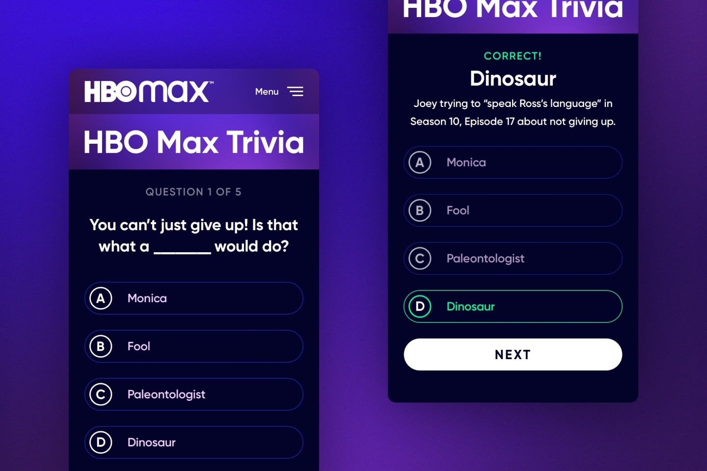
To get started, the team needed to find a fun way to learn about the content on the new platform. It was common to gamify projects at GMR. Due to the fast timeline of this project, we had to consider what was feasible.
// Strategy
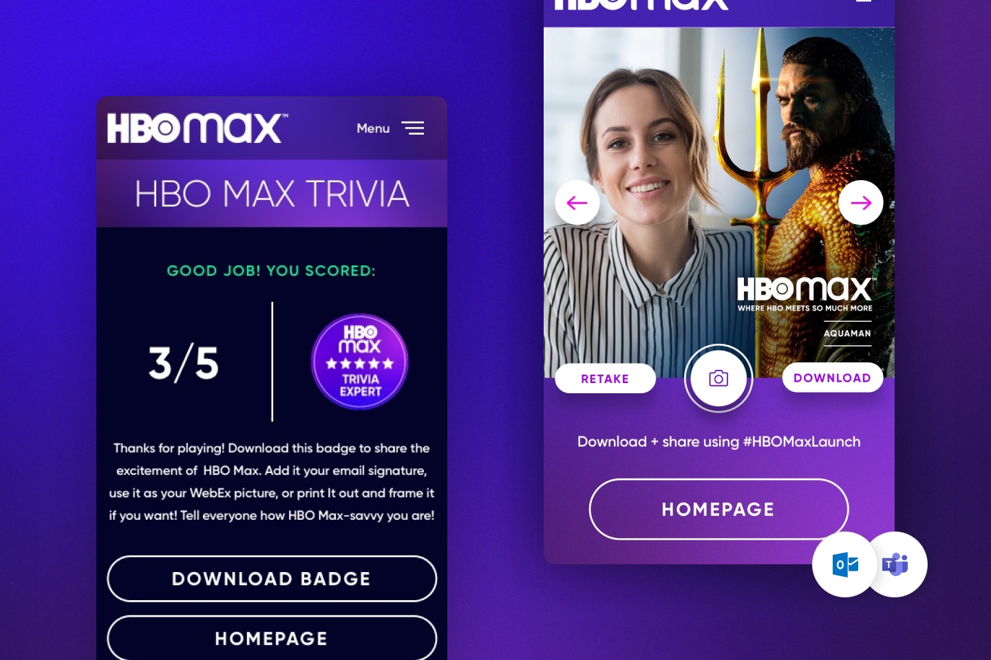
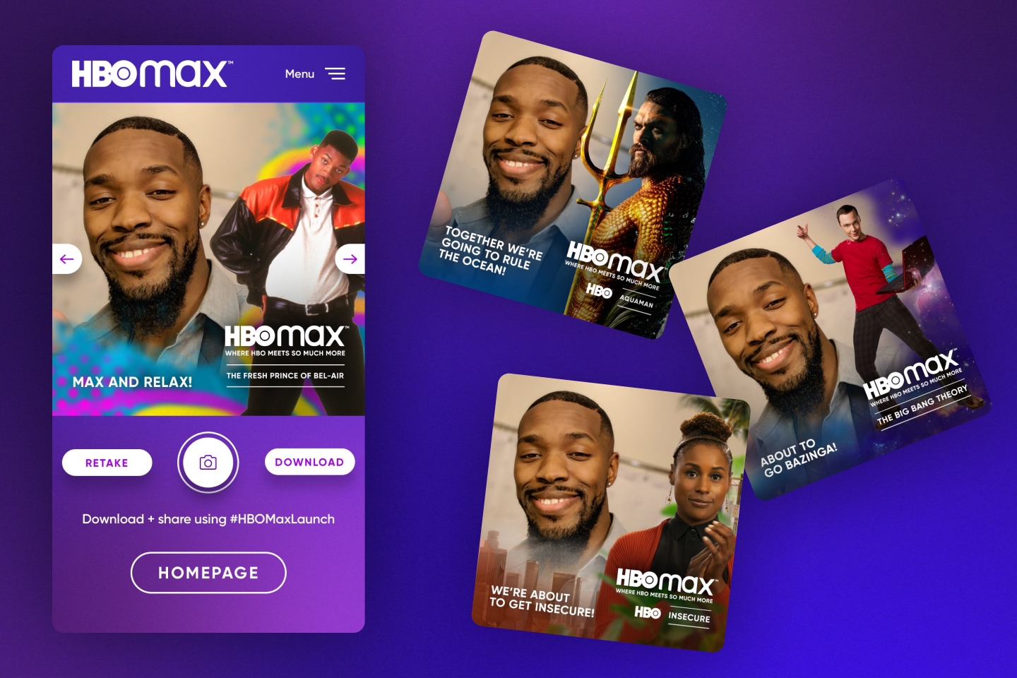
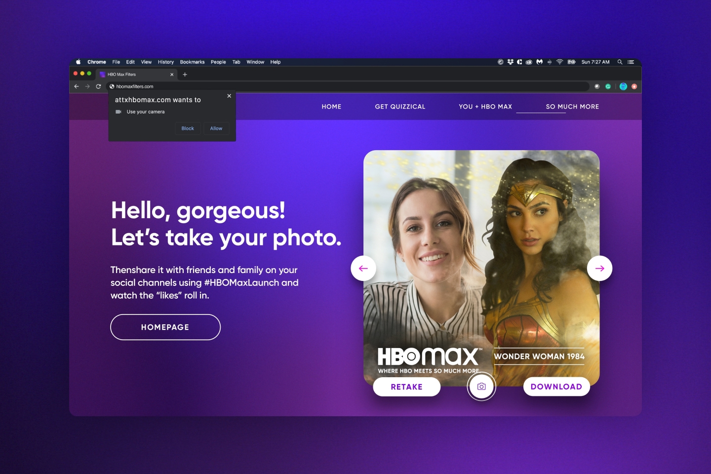
After some exploration, the team landed on two primary experiences, a trivia game and a web-based photobooth with overlays. The trivia experience was a great, fast way to educate employees on the content. The photobooth could create hype by making the experience more shareable.
// Visualization
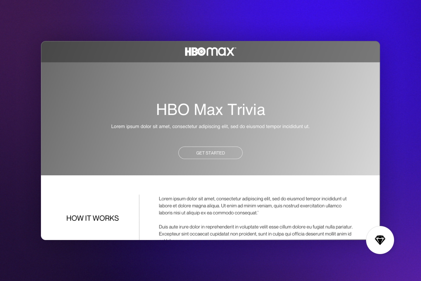
The design phase started with some rough blocking of content and elements to express the core functionality of the experience. It was important to continually check-in with the development team to ensure feasibility. After that, Mike worked with the client and a copywriter to dial in the content and aesthetic.
// Implementation
This entire project took ~1 month, so some parts of design and development ran in parallel. Throughout the process Mike and the lead developer stayed in close communication to keep the project on-track.

Outputs + Outcomes +
Outputs + Outcomes +
// Outcomes
The base trivia and photobooth experiences Mike designed for this continue to be repurposed at GMR to this day. Tracking the success of this specific project was difficult due to it being held on client platforms.
// Team
Developer
Andika Dwipayana
Copywriter
Sarah Moore
Manager
Stacy Mallak