All Content
Created:
2021-08-22
Where should we draw the line between design and front-end development?

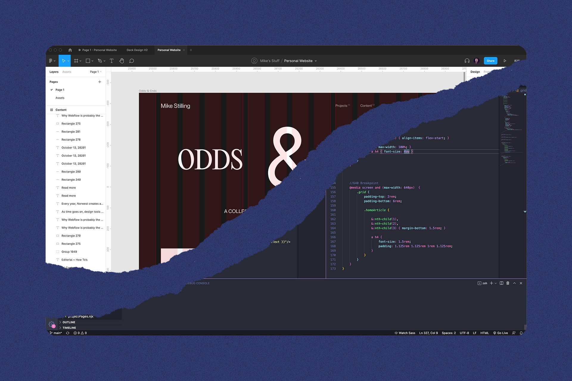
As time goes on, design tools continue to get closer to no-code development tools. When we started designing screens in Photoshop, there were less limits. There was little to no understanding of CSS in Photoshop and the layers panel was an absolute mess. We could and would add weird stuff without regard for the implications it had on development. As a result, we would make some wacky stuff and were forced to work with developers to translate visual ideas into code. Was that such a bad thing?
I believe the tools and processes we use have a massive impact on the design we create. In early stages of visual design, when time and budget permit, I don’t believe we should be considering naming conventions and whether or not our designs can easily translate into the current capabilities of CSS.
Current screen design tools have made visual exploration somewhat impossible. In tools like Figma, Sketch, and XD, we are only given access to some basic CSS properties to create and alter elements on a screen. Design tools approach to visual creation paired with our reliance on CSS for UI styling has lead to a world of sameness.
🤭 Could we learn something from print design?
What if there were job functions or phases in product and web design that operated similarly to print design. In the print world, there are production designers. Typically these designers take concepts from a creative designer or art director and translate them into something that will print correctly. In the digital world, we have some designers with “production” labels, but their focus is often on asset creation and repetitive tasks, like email design.
This wouldn’t necessarily need to be completed by two people, but by separating a creative and production design role/phase we could better encourage true visual exploration. Pairing that with a tool that had more functionality (like a mashup between Figma, Photoshop, and Blender) we could start giving designers the ability to really explore new things.
Right now, creative and production tasks are being baked into one phase, visual design, where designers must simultaneously be wildly creative and meticulously organized. Usually, designers separate this on their own. They will rough out some comps then clean them up. However, since this is usually one phase, it only gets the time “needed” for one phase. By specifically breaking this out into two separate steps at a planning level, we can create a process that accounts for creativity and innovation.
✍️ Drawing the line between design and development
The moment a designer starts organizing, grouping, renaming, or componentizing elements in a design to make a file more closely align with the final output in code is the moment we should end a “visual” design phase and start “production”. Note, we shouldn’t concern ourselves with these tasks when we are in the process of exploration. By the time we start worrying about file organization the designs should be approved and just about ready to handoff.
Work with developers from start to finish to ensure feasibility
Currently, if our design falls outside of the standard features of CSS we assume developers will say no. For us to have innovative UI designs we have to lose that thought. With tools like WebGL, we can achieve just about anything visually on a screen. Working with developers from the get-go and including them on reviews is crucial. In my opinion, most developers are looking for a challenge and/or to try something new. They didn’t get into engineering to rewrite css properties for eternity. By working directly with developers we can balance form/function and successfully push it to the fullest extent.


